10 Ways To Make Your Lead Generation Website Convert On The First Visit
Published March 25, 2017 by Brad Shorr in User Experience
Updated on October 2, 2023
Why Are First Visit Conversions Key? Because: 84 Percent of Website Visitors Convert on the First Visit.
Straight North has been validating website sales leads for over two years. Based on the review of more than 300,000 true sales leads, we have learned something startling: 84 percent of website visitors convert on the first visit.
Here is the breakdown on conversions:
1 Visit: 252,940 (84 percent) 2 Visits: 31,970 (11 percent) 3 Visits: 8,183 ( 3 percent) 4 Visits: 3,257 ( 1 percent) 5+ Visits: 3,992 ( 1 percent)
Your Website’s First Impression Makes You or Breaks You
For e-commerce, visitors may return to the website several times before making a purchase, but with business websites used for lead generation, the first impression is practically the only impression that matters. Think about it:
- How often does a business make a dreadful first sales presentation and turn the prospect into a loyal customer?
- How often does a terrible first date result in a lifelong romance?
- How often does an actor who botches the audition get the leading role?
All of these things happen, but they are RARE. And so it is with lead generation websites: If you do not make a great first impression, you will not earn a conversion, and you will only get a second chance 15 percent of the time.
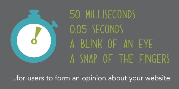
Companies that want a full pipeline of sales leads MUST pull all the stops and make their websites first visit conversion machines. These are the 10 best ways to accomplish the task.
1. Content That Stimulates Action
Build website copy around one idea: What can we say to get our visitors to think, “I have to have this!” When talking about features, concentrate on why those features matter to the customer. When talking about benefits, paint a picture!
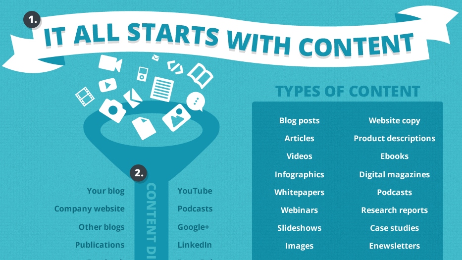
Help visitors visualize how great life will be once they have your product or service. Only if they have to have it will they convert.
5 Tips for Great Website Content
- Don’t bury the lead. Use headlines and subheads to hammer home key benefits.
- Less is more. Make one big idea sink in rather than try to fill the visitor’s head with every piece of information there is.
- Create mystery. The website is not there to replace the salesperson, but rather to make the visitor want to talk to the salesperson!
- Avoid jargon. Technical terminology confuses visitors. Confused visitors hesitate.
- Make it scannable. People scan website content, so use headlines, subheads, bold text and bulleted lists liberally to help visitors visually lock in on the main ideas.
2. Intuitive Navigation
User behavior on a website is unpredictable. Your website navigation must be intuitive, so visitors can find their way to the information they want quickly … one might say, effortlessly.
Without easy navigation, first-time visitors will get frustrated and move on — to a competitor’s website.
5 Tips for Great Website Navigation
- Use standard navigation labels. Getting clever and creative with navigation labels is a bad idea. Call the “Contact Us” link “Contact Us” rather than “Interact!” or “Dialog.” Weird navigation makes visitors think unnecessarily, which frustrates them.
- Limit main navigation elements. Main navigation should never have more than five or six options. If you feel the need for 10 or 15, you must rethink your site’s content structure to put pages in bigger buckets.
- Use drop-down menus with care. Drop-down menus for main navigation elements can help visitors enormously — or drive them crazy. Make sure your drop-down options are clearly labeled, fit the category and are not too numerous.
- Redundancy is OK. Because users have different preferences, displaying (for instance) both breadcrumbs and secondary navigation on the sidebar is perfectly acceptable — no user ever complained that a website made navigation too easy!
- Be consistent. Main navigation should of course be consistent across the site, but secondary navigation should be consistent in style and position across the site as well.
3. Relevant, Custom Imagery
Imagery either makes visitors excited about doing business with you or turns them off. Boring, overused stock images, especially when they do not relate to the topic at hand, give visitors the impression your company lacks imagination, expertise and distinctiveness.

All poor imagery does is plant seeds of doubt in the minds of potential customers.
5 Tips for Great Website Imagery
- Use captions. People always read captions, making them terrific places to talk up key benefits and features.
- Use a professional photographer. Lighting, perspective and other photographic techniques transform lifeless images into conversion creators. Well worth the time and investment!
- Keep a consistent style. Imagery conveys a brand message whether you intend it to or not. Maintaining the same color palette and visual style ensures your brand impression is strong and memorable.
- Avoid rotating header carousels. Time and time again, studies show that rotating carousels — especially self-launching ones — are conversion killers.
- Display images consistently. While images themselves can be creative, displaying them consistently makes web pages predictable and therefore comfortable to users. The top of the page and the top right area of the page are always good spots for images.
4. Persuasive Credibility Elements
Skepticism is a conversion killer — and it’s best to assume your site visitors don’t know you from Adam. However, skillful use of credibility elements helps visitors overcome skepticism and gain the confidence they need to reach out with an inquiry.
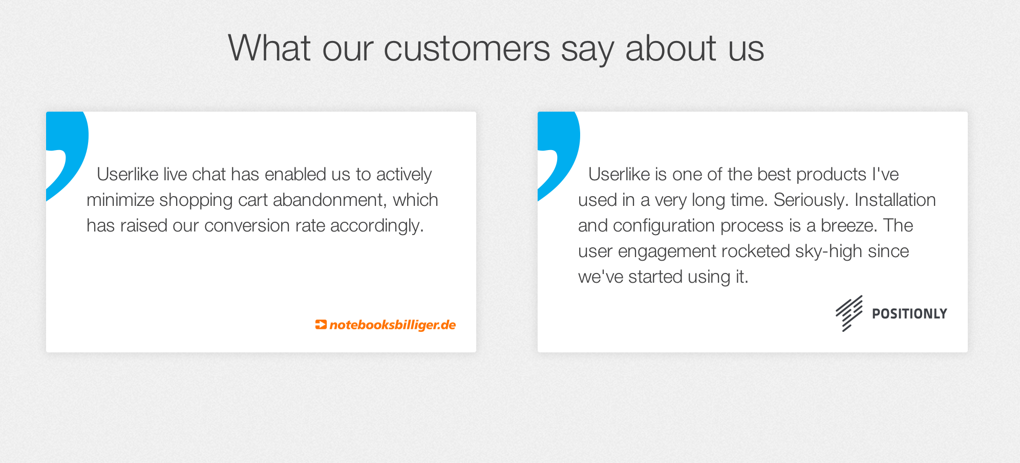
Without credibility, only visitors who are desperate will contact you, and even then, they will do so hesitatingly. Not a recipe for successful lead generation!
5 Tips for Great Website Credibility
- Use customer testimonials. Customer reviews carry more weight than what a company says about itself. When testimonials are attributed to a specific person/company and contain facts/statistics, they are especially persuasive.
- Show logos of well-known customers. If you do business with big-name organizations, let the world know. On the other hand, if your customers are not household names or widely known in your business niche, mentioning them won’t do much good.
- Feature third-party mentions. A “News” section is a good place to provide links to press releases, off-site write-ups about your company, and other third-party content that talks you up. Again, what others say about you carries the most weight.
- Use facts, not fluff. Saying you have great service means far less than saying you’ve delivered 99.7 percent of your orders on time since 2003. Facts sell; fluff, if it does anything, makes visitors skeptical.
- Focus on the right facts. What attributes of your company matter to customers? Product quality? Years in business? Responsive service? ASK THEM. Sometimes the answers are not what you expect!
5. Get Personal
It’s a well-accepted fact that emotion plays a big role in buying decisions, even in “all business” B2B verticals like financial services and logistics.
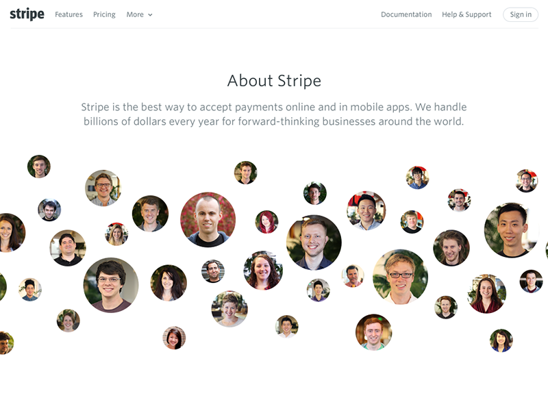
Adding a personal touch to a company website makes users feel comfortable enough to reach out and have a conversation. Without personalization, you are a cold, faceless unknown quantity — why put an obstacle like that in your own way?
5 Tips for Adding a Great Personal Touch to Your Website
- Liven up those bios. Appealing headshots are a must. Consider adding a few personal details like where the person went to school, hobbies and interests. The visitor response you’re after: “Hey, I’d like to do business with this person!”
- Talk about charitable efforts. Visitors may be quite interested to know what charitable causes your organization supports. Tell them! Fundraising events, local community activity and other good works let people know you’re after more than a quick order — very persuasive.
- Add video. Video clips are highly effective for creating a conversational, personal vibe on your site. Quick commentary from leadership, user tips from your subject matter experts, and virtual facility tours work wonders.
- Highlight company events. Photos from corporate sales meetings, baseball outings, picnics, etc., speak volumes about your corporate culture and values. These things not only attract leads, they attract great job candidates!
- Use an informal writing style. Content written in the style of a personal, one-to-one letter or phone conversation has become the standard and expected approach in most industries.
6. Irresistible Calls to Action
No matter how well you execute the other nine techniques described here, you will FAIL to capture first-visit conversions UNLESS YOU ASK. But asking is not enough — you have to ask skillfully and persuasively

5 Tips for Creating Great Calls to Action
- Smart placement. Strike while the iron is hot: Place call-to-action blocks below highly persuasive portions of content, especially on product/service pages. Not too often, though, or you will come off as being pushy.
- Consistent placement. Have a simple but strong call to action in the header and footer of each page template. Something as simple as CALL NOW text next to the phone number/phone icon is enough to make a difference.
- Give your offer substance. $10 off an initial order of $5,000 isn’t enough of an incentive; $500 is. Make your offer time-sensitive. Open-ended offers are invitations to delay. An offer expiring at the end of the month invites action.
- Guarantee your offer. Reassure prospects with lifetime guarantees, no-charge/no-hassle returns, etc. Take away all arguments for delay, and conversions will increase.
7. User-Friendly Forms
Once a visitor clicks through on an offer or otherwise lands on a page with a contact form, you’ve reached the make-or-break stage of a great conversion opportunity.
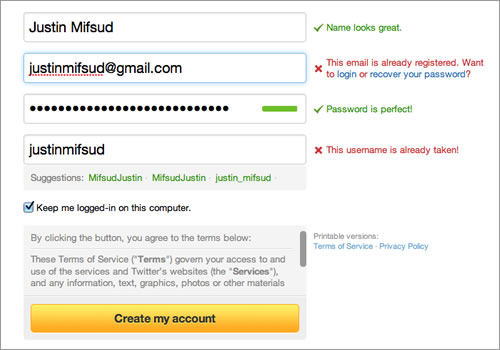
If you’ve done everything right up until now, you may yet fail if your form discourages visitors. On the other hand, a well-designed form will pull in conversions from visitors who are still on the fence.
5 Tips for Great Contact Forms
- Limit form fields. The fewer required fields, the better. While it’s tempting to try to collect all kinds of data from visitors, a time-consuming form turns most of them off, now and forever.
- Provide cues. Asking visitors to compose text from scratch (e.g., “tell us what you’re interested in”) is too much work. Instead, use drop-down menus so visitors can select the option(s) that make sense.
- Display a privacy message. Reassure visitors you will not sell or give away their email addresses and other information.
- Include the phone number. Visitors may change gears and decide to call instead of submit a form — if you make it easy for them.
- Make forms mobile phone-friendly. Mobile users need larger form fields and forms that fit properly on their mobile screens.
8. Prominently Displayed Phone Number
Phone conversions are often the best kind: Visitors who call in have complicated problems or need something in a hurry. The more effectively your website invites phone calls, the more your conversions will increase — in quantity and quality.
5 Tips for Great Phone Number Display
- Consistent, prominent placement. The phone number should appear prominently at the top right of the page template in desktop view; a phone icon should appear at the top of the screen in mobile view. The bigger the better (within reason).
- Make the phone icon a clickable link. When mobile users click on your phone icon, it should automatically display the phone number with a call option. Convenience, convenience, convenience!
- Label phone numbers clearly. If you display other numbers — such as a customer service phone number or a technical support phone number — label them accordingly so prospects have no confusion about which phone number to use.
- Invest in a toll-free number. Companies that resist using toll-free numbers are saving pennies and throwing away bars of gold. The favorite kind of phone call for a prospect is a FREE phone call.
- Track phone inquiries. Many companies fail to set up phone call tracking, and thus have no idea which marketing sources generated the phone leads. Marketing efforts are seriously hindered.
9. Continuous Testing
No matter how good your website is at generating leads, it can always be better. Great companies conduct great testing to make all critical areas of the website perform more effectively in getting visitors to convert.

Testing is an ongoing, methodical and data-driven process. When done correctly, it will put miles between you and most of your competitors.
5 Tips for Great Website Testing
- Deploy granular phone and form tracking. Tracking should tell you the marketing source of every phone and form inquiry. Without this data, marketers will be perpetually in the dark, only able to guess at which website changes are producing more leads.
- Validate inquiries. Beyond tracking, validation is needed to separate actual leads from non-leads (spam, personal calls, etc.) in analytics reports. Non-leads can account for as much as half of all inquiries, so marketers need to know which marketing sources are producing leads, not merely inquiries.
- Test only one thing at a time. If you change the offer and the position of the offer on the page, how can you tell which change led to an increase or decrease in conversions? You can’t!
- Little things can make a big difference. Companies usually test big things like offers, but the size of the font or the color of a submit button can have huge impact on conversions. Leave no stone unturned, but be patient, because you can only test one thing at a time.
- Always test functionality. Seemingly simple things can go haywire for no apparent reason. Savvy companies continually test clickable phone numbers, form submission processes and page-loading speed to detect errors that cropped up out of nowhere — and threaten to crush conversions if left unattended.
10. Mobile-Friendly Design — and Data That Will Surprise You
Mobile Internet usage is exploding. Despite the hype, our data from validating more than 300,000 online leads may surprise you:
Only 23 percent of online leads come from mobile devices.
This result (data source is 70 percent B2B and 30 percent B2C) is perhaps less than expected, but mobile-friendly design remains extremely important for three reasons: First, no business can afford to ignore 23 percent of its online lead potential; second, users converting from desktop view may have seen the site initially on a mobile device; third, mobile conversions are likely to grow as mobile Internet access continues to soar at the expense of desktops.
5 Tips for a Great Mobile-Friendly Website
- Responsive design. Responsive website design enables your website to adjust automatically for optimal display on any size screen. It’s the most practical way for most lead generation websites to get a solid mobile foundation.
- Sticky navigation. This design technique keeps the main menu in view at the top of the screen as the mobile user scrolls down a page. A must-have feature for user experience (UX).
- Embrace vertical scrolling. In the old days, companies jammed every bit of vital information “above the fold.” With mobile design, “the fold is old” — visitors are now accustomed to scrolling and are OK with it.
- Maximize page-loading speed. Slow page loading kills conversions. Your web design and development team must know best practices for handling images and many other design/functionality/hosting issues.
- Avoid PDFs. PDF documents are tough to read on mobile phones, so use them sparingly. Convert sales brochures to HTML pages instead of/in addition to offering them as downloads — that way you’ll cover the bases for all visitor preferences.
Summary of Key Data
- 84 percent of visitors who convert do so on the first visit for lead generation websites.
- 23 percent of sales leads come from mobile devices.
- Statistics based on more than 300,000 validated online leads over two years. Conversion data represents results from 70 percent B2B clients and 30 percent B2C clients.
Back to homepage
