5 Essential Usability Tips to Get Your Website Ready for 2024
Published December 23, 2015 by Markus Pirker in
Updated on January 10, 2024
Boom! Another year is over.
What did you do in 2022 to make your website more user-friendly?
Not enough? Don’t worry!
Here are five main tasks to start off with in 2023.
1. Check your Website for Dead Links
There is nothing more frustrating for your website visitors than clicking on a link that doesn’t work.
Time for some Spring cleaning.
What you can do right now:
If you aren’t already, we strongly suggest using Google Webmaster Tools to help keep your website healthy.
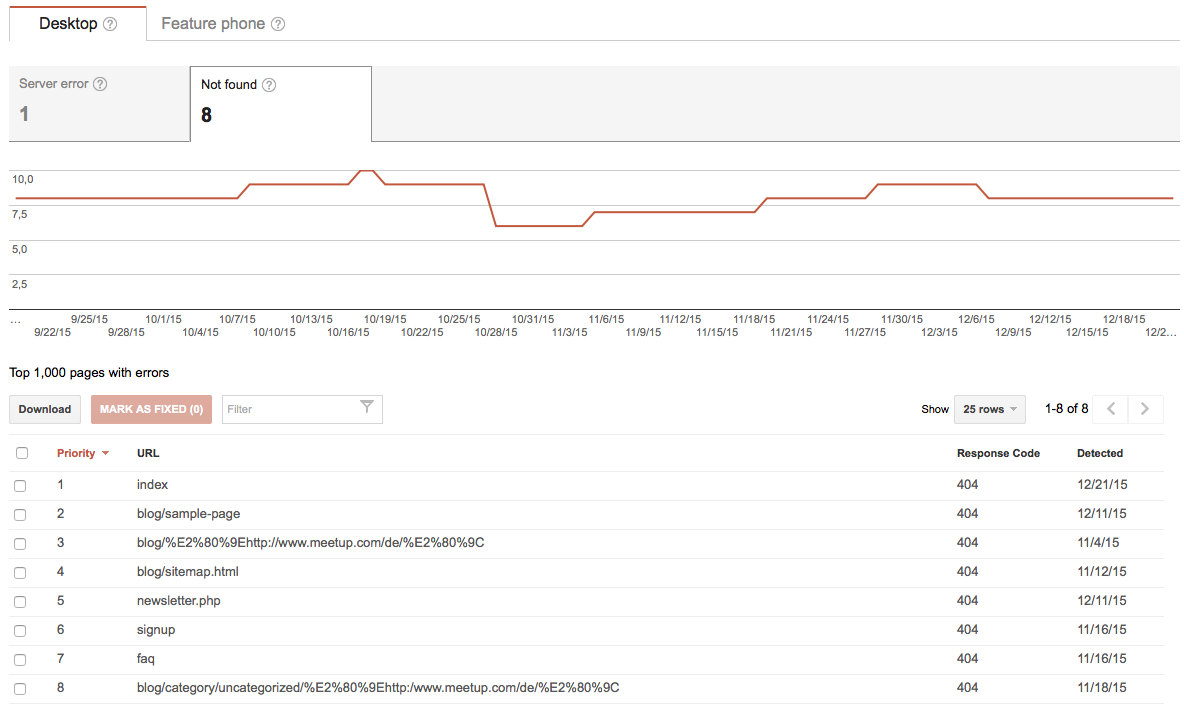
Beside other information like search terms and referral links, you’ll probably see a few 404 errors on your site.
There is an excellent post on the Moz blog on how to fix crawl errors in Google Webmaster Tools which is worth checking out.

If you’re hosting a WordPress blog, I recommend installing the free Broken Link Checker Plugin.
This plugin scans all your existing links regularly and automatically sends email notifications to blog authors and administrators.
No more broken links in your blog posts!
2. Double-check Hover states on Mobile Devices
Displaying information only when visitors hover over terms can be a great way to de-clutter your site.
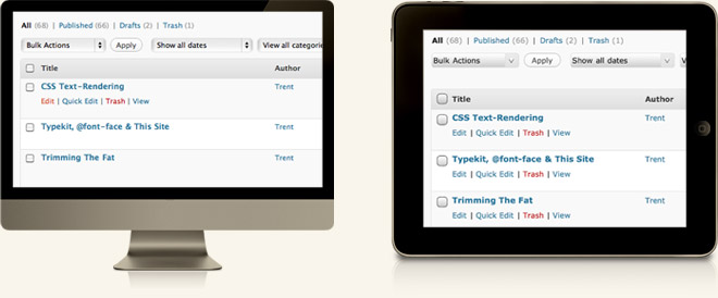
Unfortunately, tablets and smartphones don’t support hover interaction (at least not yet).
Therefore it could be problematic if your information or functionality is only accessible on hover.
So be sure to check your site on multiple devices to make sure your content displays correctly.

We came across a problem recently with a webshop we’re working on.
The visitor wrongly assumes that a product is added to his wish list after a touch on an iPad.
What really happened was that an icon that was only displayed on hover on the desktop version suddenly appeared on a touch.
The problem: Nothing was added to his wish list.
What you can do right now:
- Double-check hover areas for your site on multiple devices.
- See if information or functionality is hidden on hover on a mobile device that could somehow harm the overall user experience
- Set up a remote usability test in 3 minutes to see how visitors use your site on their mobile devices and if they encounter any problems with hover states.
3. Verify your Sign-up Flow is Error-tolerant
Already adjusted your Google Adwords budget for 2023? Great. But before investing in advertising, you should ensure that your site can react accordingly to errors.
How your site reacts to errors can make or break the customer experience. Click To Tweet
If someone registers or checks out your site, that process must be as seamless and straightforward as possible.
You don’t want to lose customers or give them a bad experience using your site!

Most of the time, we design our sites for the “best-case scenario” but forget entirely that errors can, and will, happen at some point.
How your site reacts to errors can make or break the customer experience.
What you can do right now:
- Check your registration process with actual users to ensure that: A: It works. (You wouldn’t believe how many broken sign-up processes we found during our usability studies.) B: Your error messages are easy to understand and helpful.
- Manually check the feedback and wording your validation delivers on entries that generate errors.
- Feedback should be in the users’ language (words, phrases, and concepts familiar to the user rather than overly technical terms). Review your error messages to determine if they are written in simple language. A compelling error message indicates the problem and suggests a solution. Never use language that blames the user for the error!
To learn more about error-tolerant design, there is an excellent book by Matthew Linderman titled “Defensive Design for the Web.”
4. Revise Top Search Keywords
If your Web site or Webshop features a prominent search function, you’ve already made the life of your customers a lot easier.
According to widespread estimation, your site visitors search on half of their visits.

That is reason enough to ensure your site’s search function gives visitors what they need.
Visitors become frustrated when they search for something, and the results have nothing to do with want they wanted.
What you can do right now:
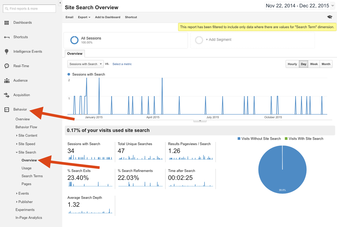
- Check your Top 10 most frequent search queries to determine if they are retrieving the expected results. If you haven’t set-up search tracking, you can do so with Google Analytics.
- Review your Top 10 search queries, and revise each one individually as needed.
- Does the query deliver any results?
- Are quality results generated?
- Are the Top 5 results relevant? If not, then manually link the search query to existing products or pages that are relevant.
Read Lou Rosenfeld’s “Beyond Goals: Site Search Analytics from the Bottom Up“ for more information about improving your site’s search function.
5. Update Your Footer to 2016
If you’re using a static timestamp to indicate the copyright year in your footer, remember to change it now to 2023!
Otherwise, just go to “Update Your Footer” and copy the snippets to display an automatically updated copyright year and save yourself a lot of hassle in 2024.
What other things are you doing to improve your site in 2023? Tell us using the comment option.
P.S.: If you want to make user testing a habit in 2023, check out userbrain.com.
Back to homepage