How to Optimize Mobile Conversion With User Testing
Published April 21, 2016 by Dan Weinsoft in User Testing
Updated on October 2, 2023
At some point during the summer of 2015, mobile devices overtook desktop computers as the preferred method of conducting a Google search. That announcement stirred up the already frenzied buzz over the e-commerce potential for mobile-initiated sales.
The reality, though, is that conversion rates for mobile still lag way behind desktop conversion.
That hard-to-swallow fact has device manufacturers and e-commerce managers trying to find solutions for mobile conversion optimization. Some say we’re on the verge of a massive boom in mobile conversion. Others say it’s wise to face the facts and focus on mobile as a search tool that can be optimized as part of the omnichannel sales journey… leading to a purchase via desktop.
At The Good, our response to just about every situation is, “let’s test and see what the results are.” In this article, we’re going to describe a current study. We’ll show you exactly how that process is taking shape:
- You’ll find out what prompted the study
- We’ll show you our analysis of the situation
- You’ll see how we designed testing for mobile users only
- We’ll reveal our findings from those tests
- You can evaluate the fixes we’ve identified, and you can suggest your own
Let’s get started.
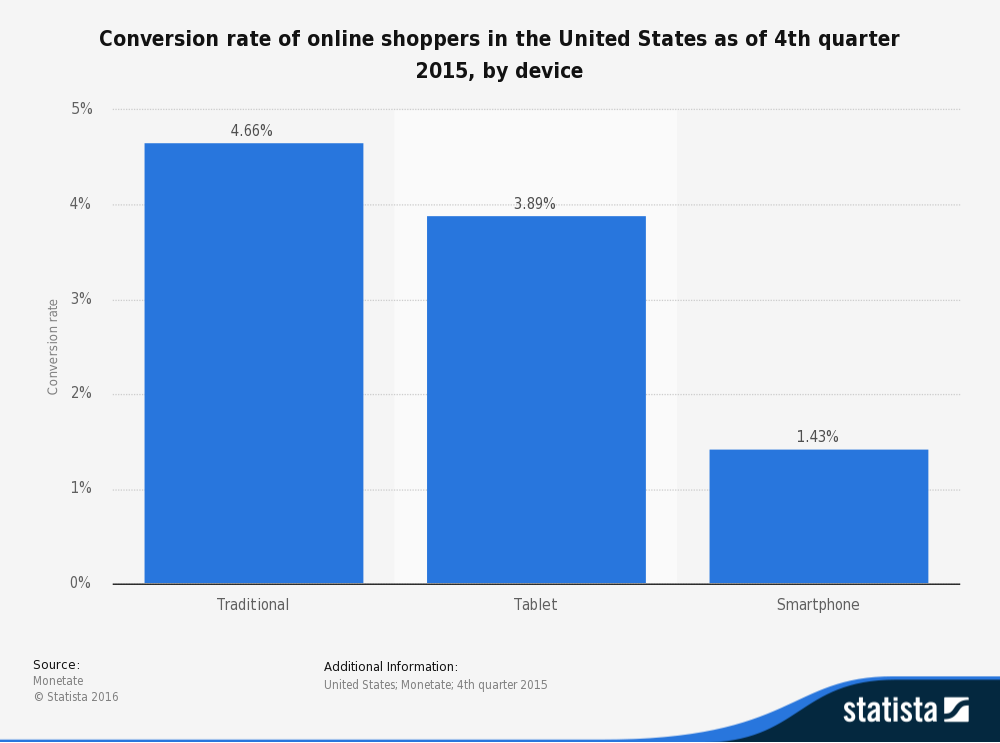
The graphic below shows the starting point for this experiment.

Notice that tablet devices are pulling decent conversions (see above). In this project, we’re focusing on smartphone conversions, though we do believe our work there has the potential to boost tablet CR (conversion rate) as well.
Mobile Conversion Optimization: The Problem
Fayettechill creates clothing for outdoor wear. They pride themselves on made in the USA quality and a focus on sustainability through their preference for organic and recycled materials. Fayettechill’s popularity is growing globally.
Looking for a way to boost ROI, they used our Stuck Score™ to locate the barriers in the buyer’s path to ownership. One of the things the Stuck Score revealed is that mobile traffic on their e-commerce site overshadows desktop traffic – yet the conversion rate for mobile is only 35% as robust as the desktop CR.
That problem, by the way, is not unique to Fayettechill. Monetate’s analysis (see below) of online CR statistics determined that low mobile (smartphone) conversions are the norm.

Mobile Conversion Optimization: The Analysis
We crunched the data from every conceivable angle, but clues to help us unravel the “problem with mobile” were few.
Here are the primary findings from our initial research:
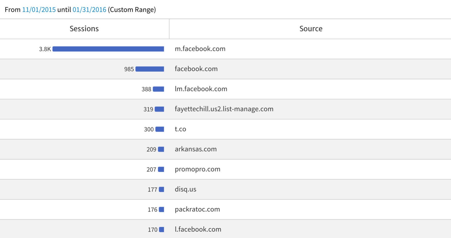
Facebook provides the lion’s share of mobile traffic to our client’s site (see the graph below).

- There are a few key UX best practices absent, but they are too embedded in the site design to test readily and aren’t likely to be major factors in the low mobile CR. For example, long page length is a concern, but heatmap data shows that more than half of all mobile users scroll all the way to the bottom of the long category pages.
- A majority of the audience showing drop-off on mobile are women, ages 18-24, with a strong affinity for casual wear and outdoor activities. Since our team isn’t collectively a good match for that target audience criteria, we needed to talk to users directly to search for reasons to the drop-off.
Mobile Conversion Optimization: How We Designed Testing for Mobile Users Only
This is where tools like Userbrain are invaluable. We designed a series of mobile-only tasks for the Fayettechill target audience. Our aim was to explore their pain points.
Those tasks included searching for products across a variety of categories. We then observed how users relied on navigation to accomplish those tasks and how those patterns morphed into learned behaviors.
We also noted features that tended to annoy users and turn them away from that particular path. At The Good, we’ve observed a guiding principle for customer experience: Customers who are annoyed become frustrated. And when they get frustrated, they abandon the site.
We also did something that usability tests sometimes forget: We observed what the users did NOT do to accomplish their tasks, and we sought to understand why.
Mobile Conversion Optimization: What the Tests Revealed
Through use of user testing, we identified several issues our data-crunching and personal observations failed to uncover.
Here are the most significant findings:
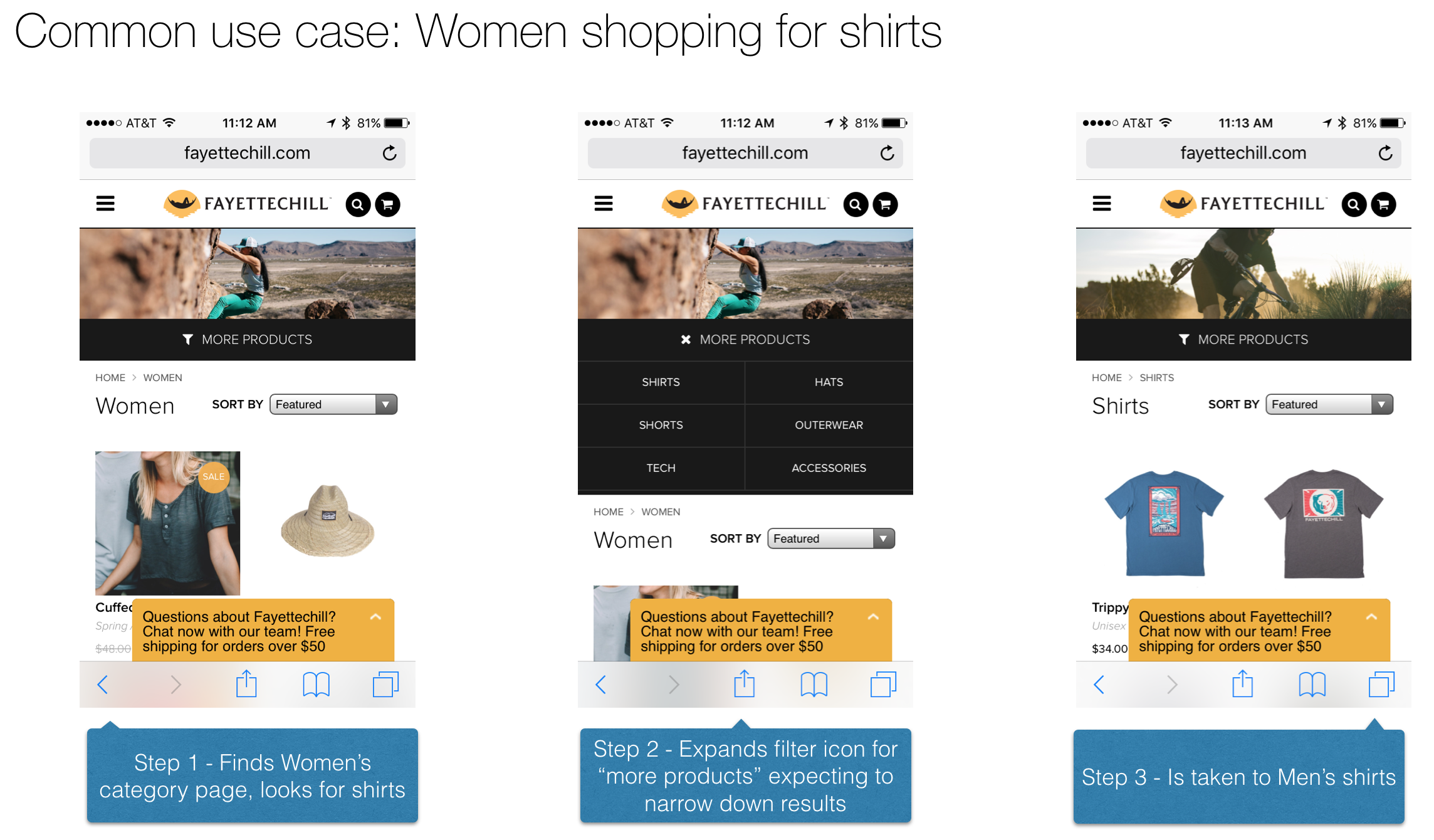
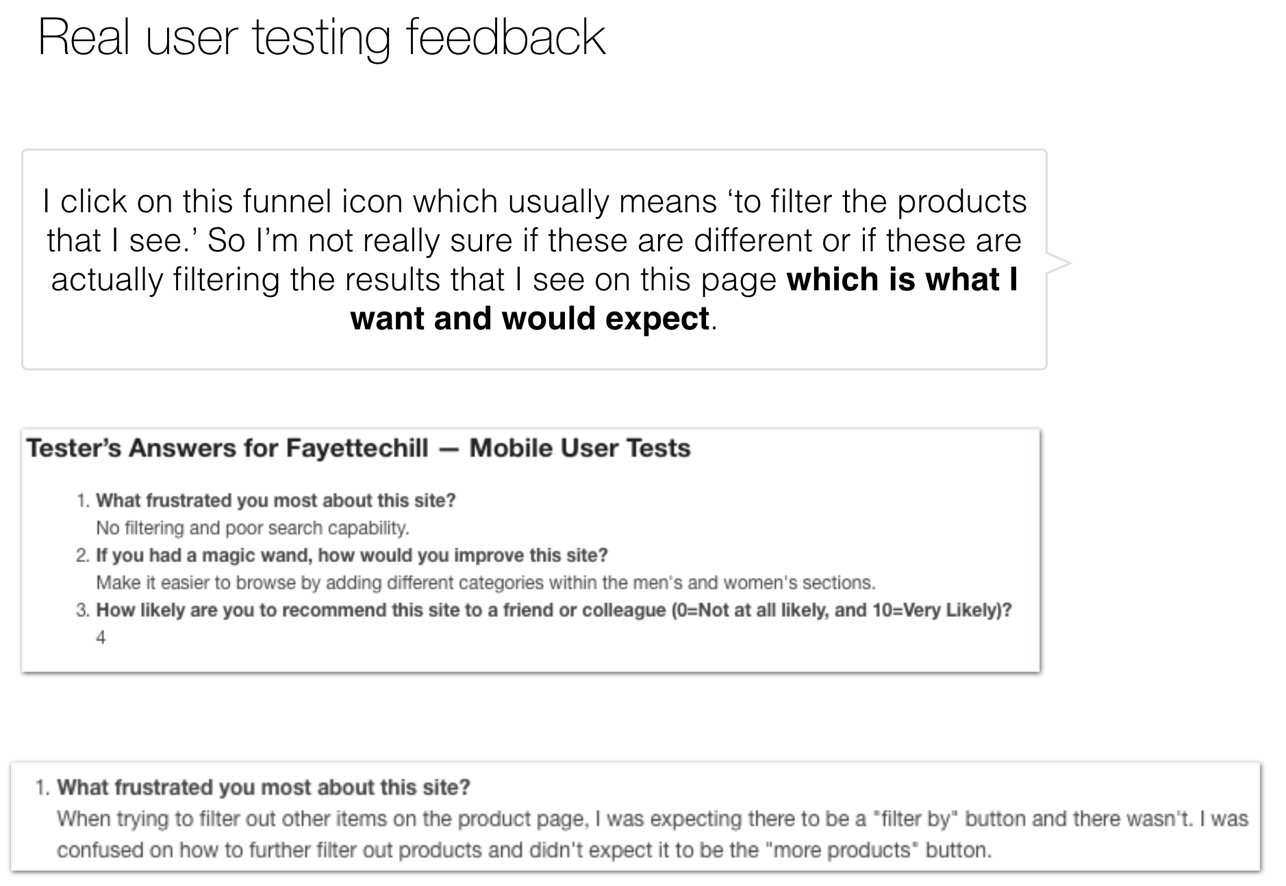
- User access to product detail pages was hindered by a lack of filtering on category pages. That caused instant frustration and a quick jump to on-site search.
- On-site search didn’t index categories, causing more frustration and site abandonment.
- Users were not clear on which products were women’s shirts and which were unisex.
- The free returns/free shipping bar was not standing out in mobile.
- A help pop-up box interferes with the user experience (UX).
- Wayfinding to PDPs (product detail pages) forces the user to take too many steps and too many clicks. Speed-to-PDP is unacceptable.
Below is a common use case (women shopping for shirts) and some examples of the feedback received.


Mobile Conversion Optimization: Fixes We Identified
Subsequent to our observations and user testing results, we recommended several potential fixes to our client.
Here are those recommendations:
- Develop new mobile-only category filtering in place of existing sub-category jump links.
- Add category pages to the on-site search index. When users enter “women’s shirts,” for example, they should automatically be taken to the women’s shirts category page.
- Add a field for all product titles on the site indicating whether the product is men’s, women’s, or unisex.
- Test color and design variations to improve appearance of the free returns/free shipping bar in mobile browsers.
- Remove the help pop-up. Replace it with a button, tab, or menu option.
We are still working with the client to implement suggestions and track results.
Do you see other possibilities for mobile conversion rate optimization (CRO) on the Fayettechill e-commerce site? What would you do to help users along the sales journey?
Another question: Do you think mobile conversion rates will soon grow to surpass desktop conversions? Why or why not?
Let’s talk about it in the comments below.
If you’d like to see what the Stuck Score™ reveals about your website, here’s the link to get your free evaluation from The Good.
Back to homepage