We Are Selling Usability Wrong, and It Sucks
Published April 24, 2019 by Markus Pirker in User Testing
Updated on October 2, 2023

As UX designers our job is to analyze and understand the goals, motivations, and behavior of people and create easy, understandable and efficient solutions tailored to their needs.
Why do we still suck at doing the same when selling our work to our clients? No kidding, I mean it – we still suck at an easy, understandable and efficient approach selling our own work, which is building easy and understandable things for others.
And I’m not talking about incomprehensible survey questionnaires or long, but unusable usability reports. What I’m actually talking about is the essence of the words we use to sell our services to others.
And I’m not taking myself out of the equation. Let’s have a look at some typical phrases I tell potential customers to sell them the benefits of user experience design or user testing:
- Great, you’re already doing quantitative data analysis, usability testing can uncover the reason behind your numbers
- Yes, you can really spot 80% of the big errors with usability testing – the number of participants doesn’t need to be statistically significant
- The ROI of a user-centered design approach is double-digit
- You should test as early as possible – you can even test things which aren’t finished yet with moderate thinking-aloud studies
- We would advise an iterative design approach to spot errors as early as possible in the development process
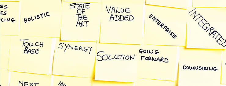
Do you see what I mean? I talk about quantitative data, statistical significance, iterative design, and double-digit ROI – perfect buzzwords to impress the CTO or Head of Marketing with my extensive subject expertise.
But my phrases totally lack one thing: emotion.
I realized this when my co-worker Andi presented me with some new ideas for our Userbrain landing page.
When you visit our landing page you can find sentences like the following one to sell the value of user testing:

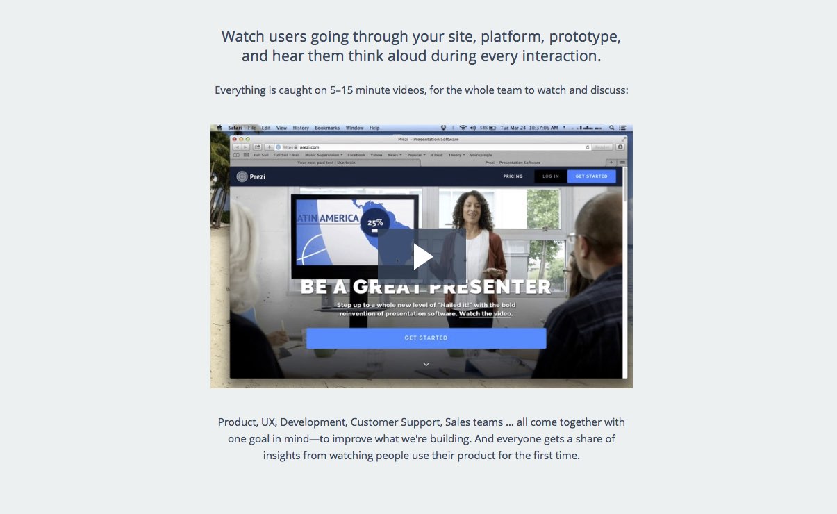
„Watch users going through your site, platform, prototype, and hear them think aloud during every interaction.”
Let’s compare this to Andi’s story based approach:
- See how Emily loves your innovative bike pump. And feel her suffering choosing a strong password to buy it.
- Mark simply doesn’t get it what your page is about. “People shouldn’t feel stupid”, he thinks before leaving your site.
- John can’t read your copy, it’s too small on his phone and the sun is glaring.
As Andi put it:
We should not just help to unlock customer insights and increase someone’s revenue. We can make usability testing fun and exciting. Something that lightens up a hard and monotonous business day. Something more than words. Something emotional.
The key part of this approach is empathy. I really want our customers feeling the same way I felt when someone used (and cursed) my design the first time. I want them to experience the same feeling of excitement and fierce anticipation when selling them the value of UX. No numbers, no buzzwords. Just feelings.
The “brand” usability engineering, user testing or user experience is dead. Let’s fix it by focusing on stories that matter again.
Emotions over buzzwords, stories over marketing claptrap.
Karl over KPI.
Back to homepage