How to Apply UX Principles to Your Next Automated Email Marketing Campaign
Published November 14, 2018 by Josh Lauer in User Experience
Updated on May 28, 2019

Marketing automation is a fantastic tool, but many marketers seem to forget that first of all, it’s just a tool. So, if you tend to use the standard email templates for everything, this may be the reason behind your subscribers’ apathy when it comes to brand engagement.
According to Seth Godin, the secret to standing out from the crowd lies in using design to become remarkable. He also says that the riskiest thing one can do right now is playing it safe. So, if your marketing campaigns are mellow and boring, it’s high time you changed the strategy.
Since the visual impact is the one that matters the most (the purple cow vs. regular cow dispute), we’ll show you how to apply well-known UX principles to your email campaigns, and make automation work for you – for real.
Start testing in minutes and get results within hours. Tap into our pool of 145k+ testers and watch videos of users interacting with your product on their devices. Discover what’s working for your product, and what’s not!
Start your free trialKeep Everything Clear
Clarity is of high importance for an email campaign, as it allows the viewer to understand your point of view from just a glance.
Easier said than done, right?
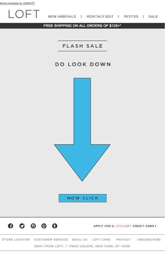
Basically, the user should receive exactly what they expect to receive when they click on a Call to Action element. Make sure labels, buttons, and other graphic elements are explicit and provide a clear description of what’s about to happen when the user clicks the button.
Clear UX design lets the user know how they will be rewarded if they make the effort to engage with the content. And your task is not only to make them want that reward but NOT to make them regret about it after.
Colors Are Important
No big news here but colors are indeed important, and you can use their power to direct your readers’ attention. But they might also be misleading and difficult to select without professional help.
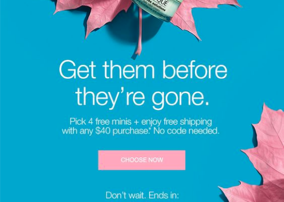
When you create your own email templates (as it happens in small companies that think of UX as a once-off task), you’re most likely at risk of using two or more contrasting colors. While this is a good technique, it’s important to understand where and when to apply a different color. As it turns out, the only time this works is when you’re trying to put the attention on the call to action element (like in the image below).

As you can see, this email template successfully uses two contrasting colors to get the Choose Now button into focus.
The strategy works because the colors complement each other and there is an elegant blend in place. The color variation grabs a reader’s attention while also offering clear and well-focused information about the campaign.
Simplicity Trumps Complication
Simplicity is one of the most important UX principles because it creates easy to understand designs. Starting with your site’s interface and ending with email templates and automation campaigns, everything should follow the rule of simplicity.

But, when it comes to emails, simplicity can be a huge challenge because space is limited, and you have so much information to pass on. However, it was proven again and again that a simple email template provides better results because the message is easier to understand and remember.
For instance, a new subscriber would receive a long email where you talk about a new campaign, give them a great offer and the promised ebook. This is confusing and downright intimidating.
The solution: Use automation to send three emails instead:
- One welcome email to new subscribers and attach the ebook
- A different email for the new campaign you’re running
- A third one to send that amazing offer.
Still, you need to make sure the emails are well-scheduled, so a new user won’t feel overwhelmed with information.
Use Text & Image to Your Advantage
When it comes to emails, there is no universal truth about the use of text and visuals. Marketers use both, and both types seem to behave differently depending on the type of campaigns. So, it’s important to know how to communicate your pitches through a combination of text and visual.
The idea is to make sure the message is clear using text and images or their creative combinations. But how do you know your message is clear? If you are sure your email template looks nice, the design is good, and everything is made according to the best recommendations – you are very wrong here. There is nothing worse than being sure it is going to work because you think so.
So what can you do here? Right, test, test, and test.
Testing is the only way to see what really works for you and your brand and this has been proved so many times (e.g. here or here).
Use Visual Effects and Animations
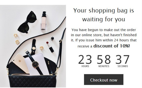
Tools such as timers or animations revealing discounts unique to the viewer are popular these days but they should be integrated correctly in the email interface.
As long as the template makes perfect use of the simplicity principle, visual effects and animations can grab readers’ attention.
For instance, using a timer tool will tell the targeted audience that the offer has an expiration date (or time) and they should hurry up.

Furthermore, you can use automation software to send a reminder when time is close to running out. This way, you keep readers in the loop and increase engagement with the brand.
Choosing the Right Automation Software
The visual quality of your email campaign depends on the software you’re using. That is why visual builder should be a must in the software you choose. This is particularly important for small to medium businesses as it allows anyone to create a decent email template.
However, it’s important to understand that an automation software, regardless of its many amazing features, must meet your individual needs as a brand. So, before making your choices based on a visual email template builder, first check if it has what it takes to help your brand engage with readers. If you are wondering what aspects of automation software should be compared, have a look at the example of tools comparison here.
In Conclusion
As you can see, UX principles are just as important for your email campaign as they are for your website or app design! A well-thought template, right colors, images, and visual effects can boost any campaign. On the other hand, the wrong combination of color and an email template that doesn’t follow the rule of simplicity can (and will) confuse readers.
So, before you dismiss the idea of hiring a professional designer to create email templates, think about the results you want to achieve. User experience is crucial when you want to stand out and differentiate your products or services from the crowd.
Back to homepage