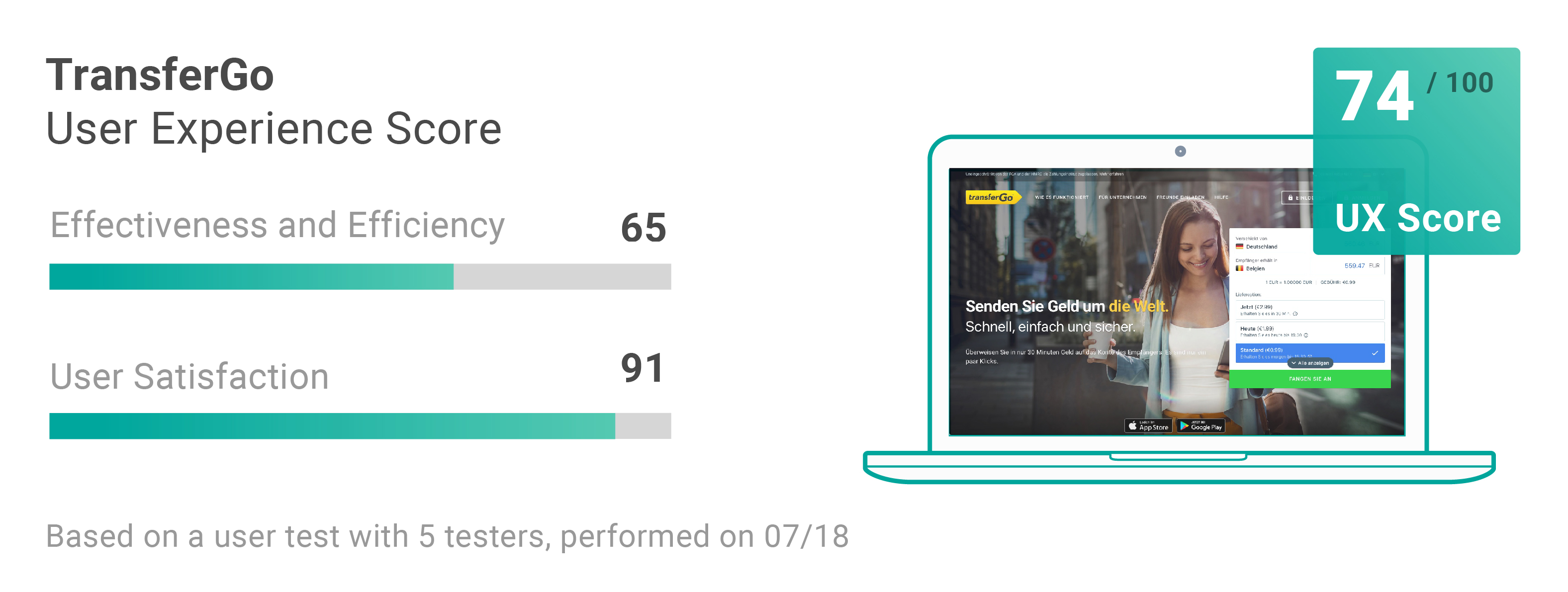
TransferGo is a platform for international money transfers. We tested the website in the context of user tests. The UX Review result: a good user experience with smaller but annoying usability issues.
Sending money online has never been easier, but how easy is it really? To answer this question, we are currently conducting a detailed benchmarking study analyzing the user experience of online money transfer with TransferGo and nine other leading money transfer services.
In collaboration with Monito, the leading reference website for international money transfer services, we are evaluating over 50 usability tests of first-time adopters looking to transfer money internationally.
Start testing in minutes and get results within hours. Tap into our pool of 170k+ testers and watch videos of users interacting with your product on their devices. Discover what’s working for your product, and what’s not!
Start your free trialWhat we’d like to know about TransferGo
We want to learn everything we can about the actual user experience of TransferGo. In detail we’re looking for answers to these questions:
- What do people think of TransferGo’s homepage and is the purpose of the service clear for first-time users?
- How easy is it to open an account with TransferGo?
- Can users set-up a money transfer in another currency to a foreign country and what are possible road-blockers?
- Are users of TransferGo able to figure out how much their transfer will cost and how long it will take?
How we’re recruiting our test participants
We’re using the panel of the online usability service Userbrain to acquire our testers, automatically send them the task scenario and let them record their tests on their own devices in their familiar environment.
As we’re looking to evaluate the first time experience of people, we only use testers who haven’t used the site before and test the Desktop version of the site.
The task scenario we’re using for TransferGo
Usability testing is easy and you’ll get valuable insights even if you’re doing it for the first time. You can do almost everything wrong – as long as you get your tasks right your usability testing will always work.
Here’s the task scenario we’re using to evaluate the user experience of TransferGo:
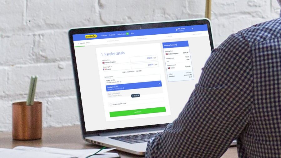
Imagine you live in the United Kingdom and need to send around £250 to a friend who lives in France as a wedding gift.

Your friend sent you his bank account details (the IBAN) and the money should be received in the local currency (EUR).

You want to send the money online, and after researching options for your transfer, you arrive on this website.
If you’re just getting started with writing your own usability task scenarios, here’s a short list of rules to write useful task scenarios:
- Avoid giving clues in the scenario. Don’t use uncommon or unique words used in your website or app. Testers will scan the screen to find these words and you won’t get many insights about the usability of your website.
- Write in a clear, understandable, and easy to follow way. Write the way you talk and don’t try to sound scientific or academic.
- Pre-test your tasks with colleagues or friends to make sure they are easy to understand and people really know what you want them to do.
- Trim any detail that’s not absolutely necessary. Your task scenarios should set a context and provide users with necessary details like a username or a special delivery address. Everything else is unnecessary.
- Keep your task scenarios as short as possible and let testers figure out things for themselves.
Don’t forget: Provide fake data for your task scenario
Because transferring money is quite sensitive and people will be recorded using the site, we don’t ask our testers to provide real information.
Providing fake data in your task scenario makes sure that testers don’t need to spend valuable time figuring out which data passes the form validation of the registration.
Here is the dummy information we used for this task:
[DUMMY PROFILE]

Make up fake email adress, name and birthdate
You can use the following phone number: +44 3069 990333
And the following address : 21 Poland St, Soho, London W1F 8QG, UK

[DUMMY RECIPIENT]

Make up fake name and email adresss for the recipient
You can use the following IBAN for the recipient’s bank account:
FR14 2004 1010 0505 0001 3M02 606
About the testers
We had 4 male testers using the site on their desktop devices. You wonder, why we’re running our study with 4 testers only? Learn more here.
So let’s get back to business and find answers to our questions:
What is the first impression about TransferGo’s website, is the purpose of the service clear?
The immediate overview of prices and conditions creates clarity for the user. The people displayed in the background of the homepage give a personal and familiar impression. Many testers are impressed by the number of countries in which the transfer is supported.
“Available in 47 countries. Wow! And for Canada too. That’s great!”
Address autocompletion
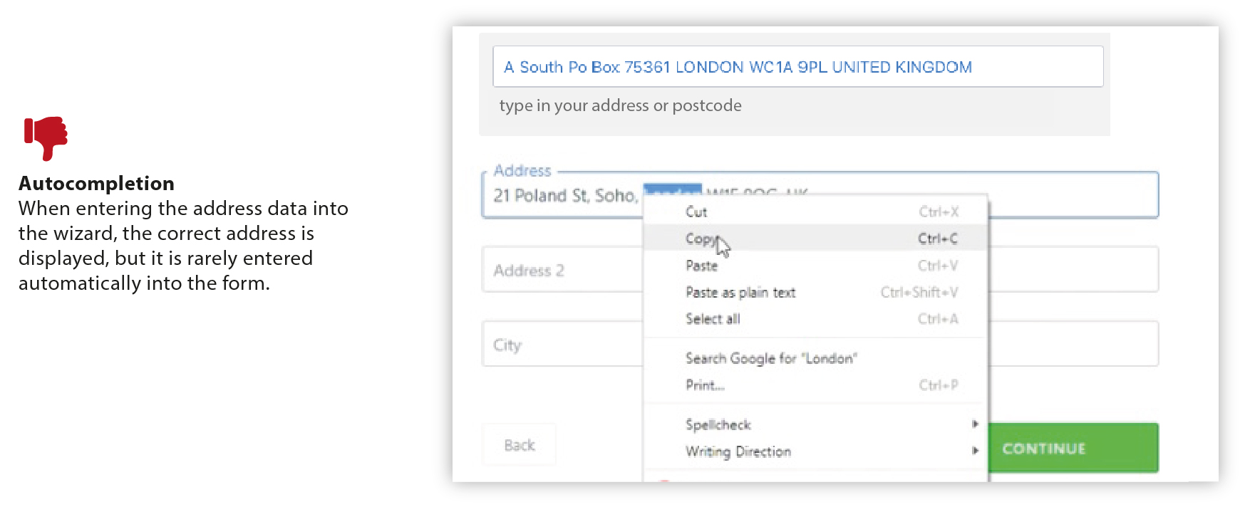
For customers from the UK, TransferGo provides autocompletion for entering addresses.
This input field was used incorrectly by 4 out of 5 testers. The full address was copied into the search field and then the individual information was entered into the form via copy and paste or manually. However, automatic completion of the address did not work.
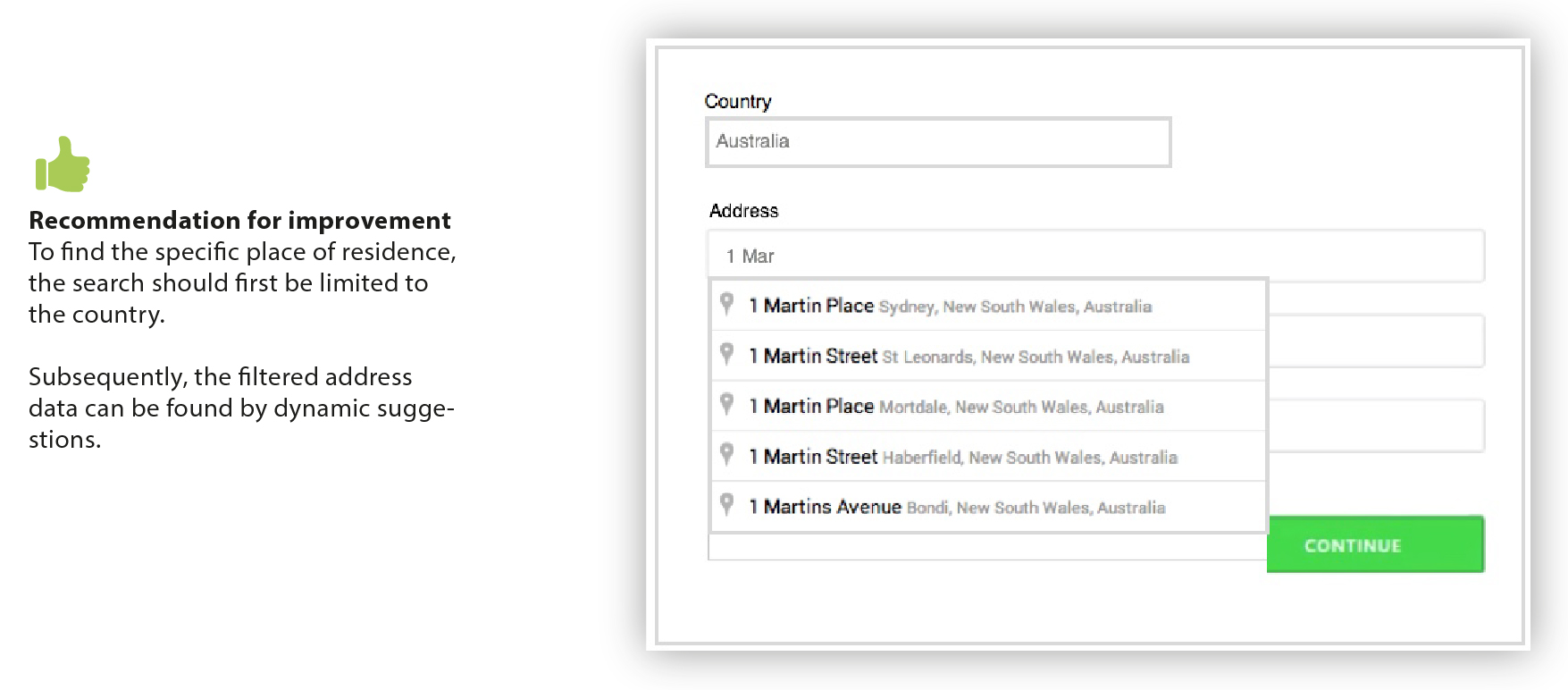
Improving this feature by identifying the country and a dynamic search with suggestions for street names and houses numbers is highly recommended.
Do you wish to transfer money from A to B?
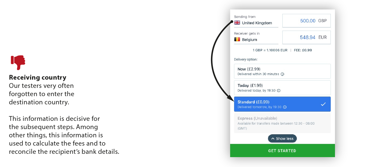
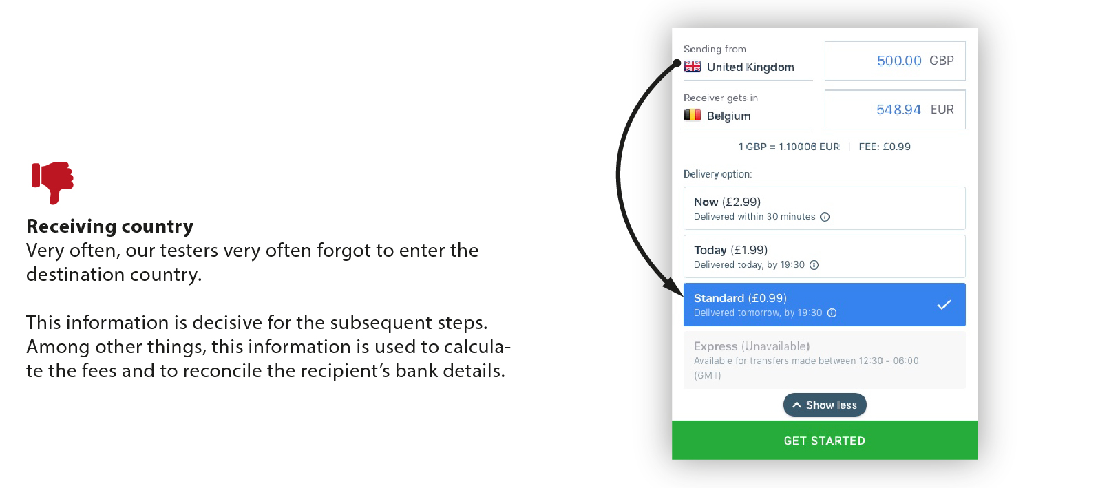
On the homepage there is the overview with the country selection and the delivery options, as well as the exchange rate and transaction fees. Almost half the people first registered on the website and then looked at the transaction price models.
Despite the good overview, our testers forgot once and again to select the recipient country or to control the amount of money for the transaction. Instead, the look of the user was always directed immediately at the delivery option.
Transfer details
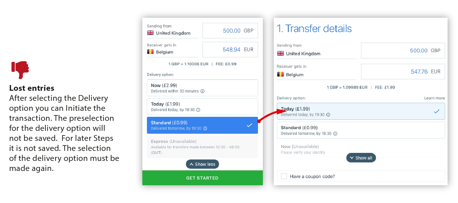
If the registration steps for a new user are followed, and after entering all the information, you are then asked to enter your email and define a password.
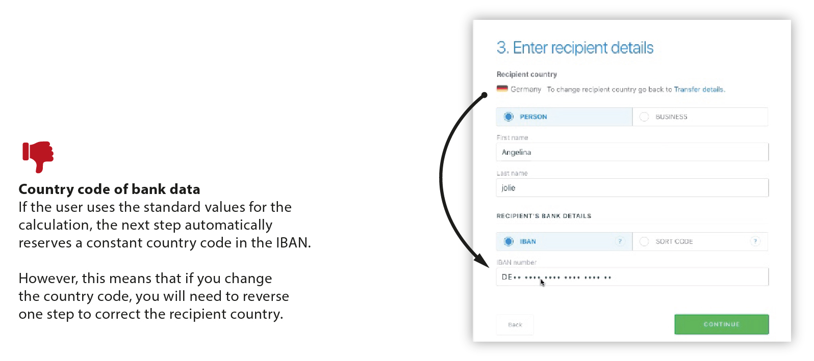
This step takes you to the details about the fees. The country of the sender and the country of the recipient are displayed here. The delivery option was automatically increased to the most expensive rate after registration. Unwary users pay it.
How easy is it to create an account with TransferGo and what security measures are provided?
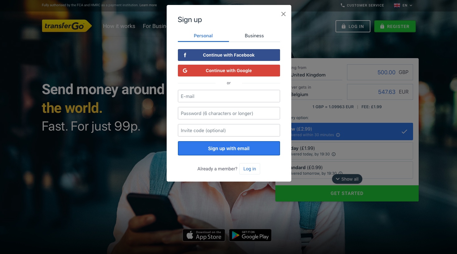
Short answer: Very easy. Our testers were surprised by how easy registration on TransferGo is. There are many ways to open an account. For example, via Facebook, Google or a registration via email.
This is what the testers said:
“I typed my email and password and just had to click on a button.”
“Signing up with Facebook is super easy.”
Surprisingly, there is no security prompt during registration to intercept potential attacks from automated logins. The password policies are “at least 6 characters” and are definitely too low for a service that deals with such sensitive data. At least the use of a capture field or a security question would make sense.
Country selection
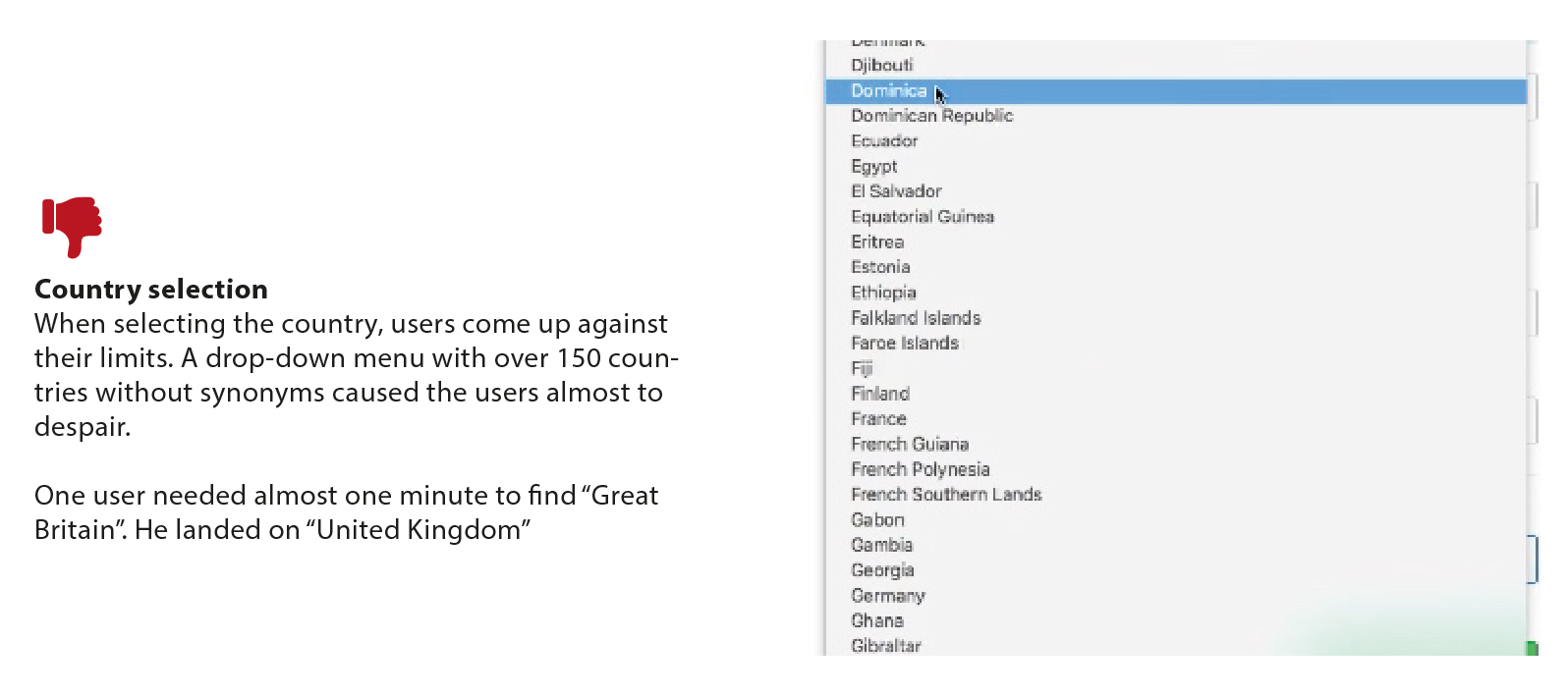
In the registration step, users often spend a long time searching for the home country. This step puts users to the test. They have to search for the exact name of the country. The choice of country from the drop-down list of estimated 150 countries, usually takes more than half a minute.
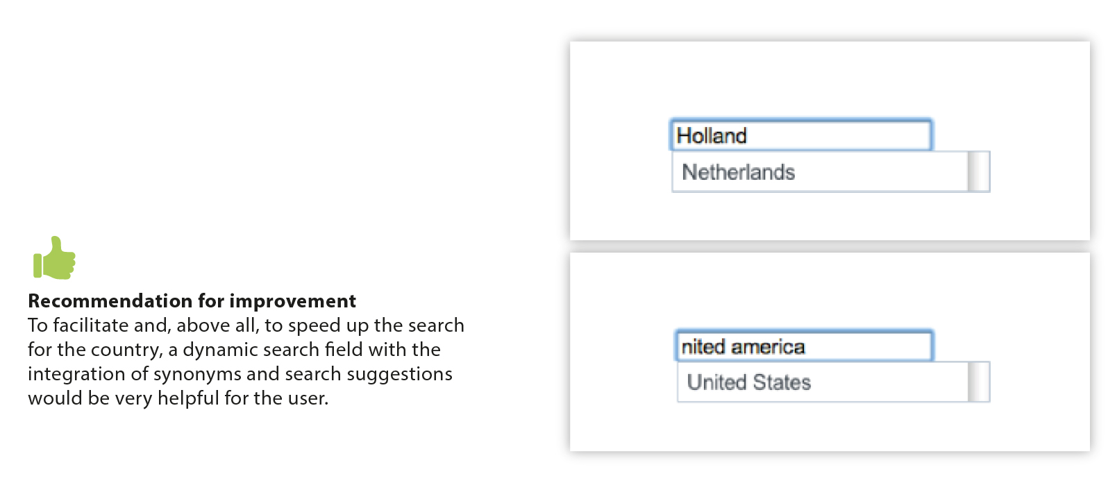
Our recommendation for improvement: An entry box which prompts the user to enter their country Entered terms are matched with a database and supported by suggestions. Thus, synonyms and spelling mistakes can be avoided.
Why is the country selection often a usability issue?
The solution of selecting countries with a drop-down menu is a classic usability mistake. Users need to navigate through a long list in the drop-down menu. Additionally, synonyms are not considered in a static drop-down. Learn more about how to organise the country selection.
Can users set up a transfer abroad in a different currency and what are the possible barriers?
TransferGo provides a detailed and transparent overview of costs and services. However, it is difficult for the user to keep track. Thus, the destination country is often overlooked, and the attention is directed mainly to the currency and the conditions.
Can TransferGo users find out how much their transfer costs and how long it will take?
All our testers were able to easily figure out how long the transaction would take and how much the fees would be.
UX Review result: A great user experience
When asked if they would trust TransferGo with their money, most users said that TransferGo definitely looked trustworthy. The people displayed give the impression that they are interacting behind the homepage, which increases user trust.
In the end, all our testers agreed that TransferGo is a clear and easy-to-use platform:
“This website is absolutely easy to understand.”
“I rate TransferGo’s website with 9 to 10 out of 10 possible points; it was really easy to get my bearings and enter my information.”
“I am impressed by the service. All in all, a good product. The only criticism is the entry of several personal data.”
“Transfers with TransferGo are super easy and fast, this page is already saved among my favourites.”
Would you like to learn more about how we test and what factors affect the UX rating of this site? We are currently writing a review about our testing process and will post it soon.
Would you like to read more UX Reviews like this one? Get a complete overview of TransferGo’s experience and 9 other leading online money transfer companies in our full report.


