UX Teardown: Influenster.com - Two Testers, Different Approaches, Head to Head
Published May 5, 2016 by Stefan Rössler in
Updated on October 2, 2023

Welcome to our second episode of UX Teardowns!
For this week’s episode we decided to test with two users and compare their experiences by showing you the videos head to head.
We didn’t do this because 2 is the magic number, but to show you how you will already start to identify usage patterns by comparing two different testers, and their unique perceptions of what they are presented with. Sometimes different, sometimes similar.
That’s why its important to do more than just one test if you want to make informed decisions about how to improve your design. Of course.
Even the best test with the perfect user will only give you one perspective on the usability of your site or app. But if you watch dozens or even hundreds of user tests, you will get a completely new understanding of your user experience.
But now without further ado, let’s dive into it …
1. What are we testing?
This week we decided to test Influenster.com:
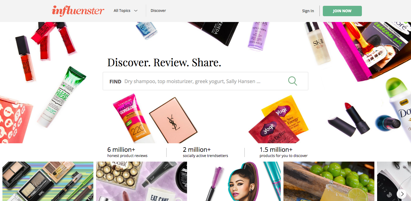
Influenster.com is a product discovery platform and review site that helps members find new products to try and get advice so they can make informed purchases. We help our members compare products and guide them on how products can be integrated into their life. We inspire a love for products and encourage conversation, discovery, and reviews.
From what we got after exploring Influenster.com for a few minutes for the first time (without reading that beforehand), we figured it’s a platform to compare prices of different products on different ecommerce sites. And there seemed to be a notable emphasis on product reviews.
That’s if you were wondering what we thought of it.
There’s of course more to the site, but this was enough for us to come up with some tasks to test the site.
2. Come up with tasks
Our first step, as always, is to decide what to test and to come up with a set of tasks.
Influenster’s main headline “Discover. Review. Share.” inspired us, so our tasks are:
- Discover a product
- Leave a review for this product
Note: We didn’t include the sharing part since our testers will probably use fake login credentials and wouldn’t want to share something from a fake profile.
Tasks are just a set of jobs-to-be-done on the site, and they’re not something you give to the testers. They are just your guides for creating scenarios.
So let’s move on to that.
3. Turn tasks into a scenario
The scenario motivates your tester, gives them some context to work in and a goal to accomplish. Motivation drives us humanz.
We’ll start of with a first impression, just to see if the testers get what the site is about at first glance:
Please take a look at this site and tell us what you think it is:
What can you do on this site? Who is this site intended for?
Just look around and speak everything that comes to your mind.
After the first impression, we combine the two tasks from the previous step into one scenario (yes, you can do this, no biggie):
Now imagine you decided to leave a review for a product you regularly use (like a shampoo, razor, pet food …). Try to find this product and speak your thoughts while writing and submitting your review. You can use fake data for everything the site asks you to enter.
See, no need to create separate scenarios for each task.
We didn’t want to waste time on the tester coming up with a product (because it took us a couple of minutes to come up with one ourselves) so we gave some suggestions.
What is important is not the product, but HOW our testers find this product, and HOW they get to leave a review for it.
Note that the scenario is not perfect. It can always be better or done differently. So don’t get caught up in the details, and don’t be afraid of mistakes, because as we always like to say—even if you screw something up, you can still get valuable insights from user testing.
And once that’s done, we just copy the scenario, paste it into Userbrain‘s dashboard, and wait for our video to be delivered.
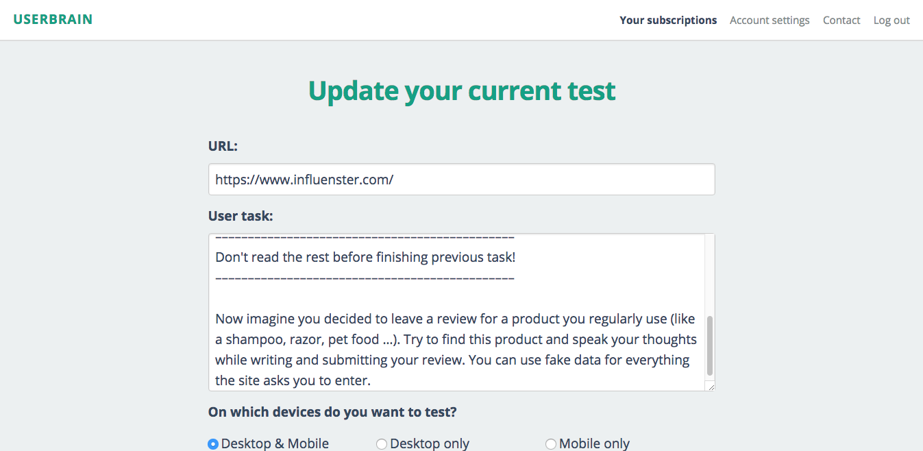
We usually recommend testing only one scenario at a time, that’s why Userbrain doesn’t offer more than one field for entering scenarios. But for the teardowns we found a way to work around that (as did some of our customers ) and we inserted:
ImportantDon’t read the rest before finishing previous task!
And as you’ll see, it worked…
4. Analyzing the test
After deploying our test, we received two videos from two women (now don’t sue us for no diversity, it was random).
The two women have two completely different approaches as you will see. One is more quiet and the other is talkative. What one didn’t notice, the other did. One was good and one was evil. No, kidding.
We couldn’t have gotten two tests like these if we asked for them.

Now let’s check out their first impressions. And for further reference, let’s just call our first tester Britney, and our second one Beyoncé.*
*One of them has curly hair so Queen B had to appear. We don’t know where Britney came from though… She’s also a Queen B
First impressions:
↑ Beyoncé ↓ Britney
Both start with a similar first reaction, by saying that the site seems to be for women.
After that, their experience diverges, and while Beyoncé is impressed by the huge number of product reviews, Britney gets attracted to the images and comes to the conclusion that the site is some kind of beauty-related magazine.
A picture is worth a thousand words, and while Influenster.com doesn’t say anywhere that they target women (they’re only mentioning members), their imagery clearly conveys the message that this site is for the female population interested in beauty products.
If that’s what Influenster.com wants to convey, they did an amazing job. If not, well …
It’s interesting to note though, that if you look at the featured topics on the bottom of the page, you will find out that the site has much more to offer than lipsticks and eyeliners:
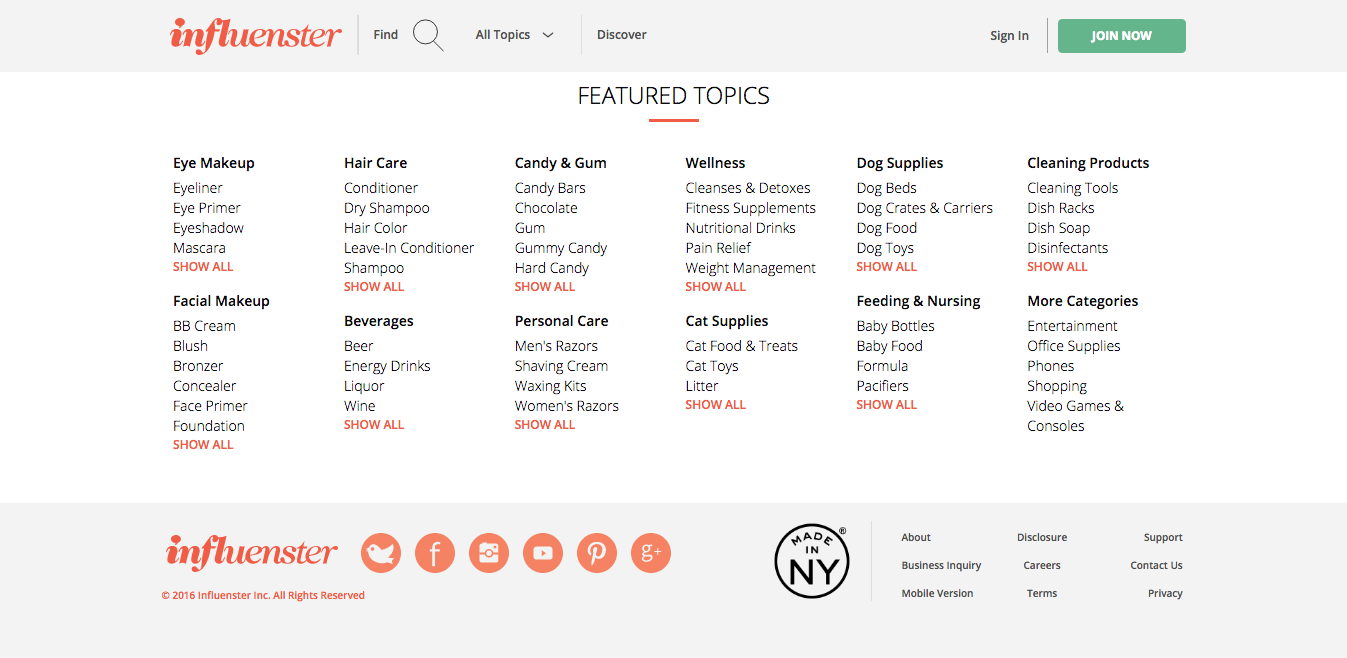
Did you expect this site to feature beer, liquor or wine? What about video games and consoles?

Now note that the main headline is “Discover. Review. Share”.
Both testers probably ignored that since they haven’t commented on the headline or made any other remarks that would suggest that they have read this bit of information (or maybe they just dismissed it for not being useful to them).
Even though the scenario asks them to say what they think the site is for, they don’t comment on the headline and the search field underneath it that might suggest that it’s a site for discovering products and leaving reviews for them.
The only way to shed more light on this observation is to watch even more people testing the site. Usually the headline copy helps users to identify the purpose of the site.
If it turns out that other users don’t pay attention to it either, it might be worth thinking about how to improve that part. We have more suggestions at the end of the post.
But now let’s move on to the next clips.
Exploring the site:
↑ Beyoncé ↓ Britney
While Beyoncé moves on to explore the product overview page, Britney takes her time to investigate the topics before digging any deeper.
What’s particularly interesting about this is, that while Beyoncé has already come to the conclusion that the site is for women and goes on with this assumption, Britney discovers that her first impression was wrong and that the site is for men too.
And as she keeps looking around and finds out that her first impression was actually completely wrong and that the site is about much more than just beauty.
Why am I pointing this out?
Because you can’t expect every user to spend enough time to figure out the exact purpose of your site. That’s why your main headline and images have to convey the message, because as you see, some people rely on this incredibly fast and effortless way of communication and they won’t investigate any further to see if their first impression is really correct.
And while Britney is busy with figuring out the actual purpose of the page, Beyoncé sticks to her initial impression and moves on to using the site.
She explores the site’s features like the ability to compare products, to filter them by reviews, or even to follow products and get updates about new reviews and such.
The interesting thing is that Beyoncé identifies the purpose of the site, but not the target audience, while Britney, figures out the target audience but not the purpose of the site.
Let’s find out how their journey continues …
Search vs. Topics:
↑ Beyoncé ↓ Britney
As you see at the end of both clips, our two testers end up on the product detail page—but the way they got there differs for each of them.
While Beyoncé disregards the categories and moved on to use the search function after just a few seconds, Britney took the path through the topics menu on the top of the page.
Usability studies show that more than half of all users are search-dominant and they will usually go straight for the search button when they enter a website. The other half will either be link-dominant (about 20%) or show a mixed behavior, depending on what seems most promising to them at any given time.
You can connect these behavior patterns to real life shopping:
Think of people who use the search function as those who enter a store and immediately start looking for a shop assistant to ask for a product. They don’t waste time wandering about looking for something.
People who are link-dominant are the ones entering a store and searching for the right section or aisle to find the product they’re looking for.
And people who show a mixed behavior are those who enter a store, find the right section or aisle first and then ask someone in this section to help pinpoint the product. Just like Britney who first clicked on a section to narrow down the possibilities and then used search to find the exact product she was looking for.
Leaving a review:
↑ Beyoncé ↓ Britney
The first part of both clips shows the signup process. One thing you’ll notice are the mascaras in the background. Another hint that this site is supposed to be for women only.
Maybe mostly women came to the site and marketing decided to adjust the aim. But women do have men in their lives, and this site has male products that they might want to discover, review, share… Why have them and hide them?
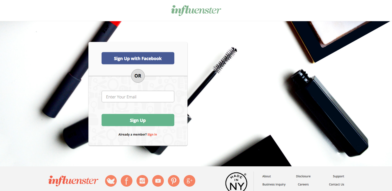
You’ll also notice that the registration is straightforward and doesn’t ask for any unnecessary information. They even provide the possibility to sign up with Facebook which is always a useful feature to speed things up.
Later, when you look at the part where Britney and Beyoncé are writing their reviews, you see a great example of gamification, used to motivate people to get crucial tasks done. We’re talking about the progress bar on top of the review box:
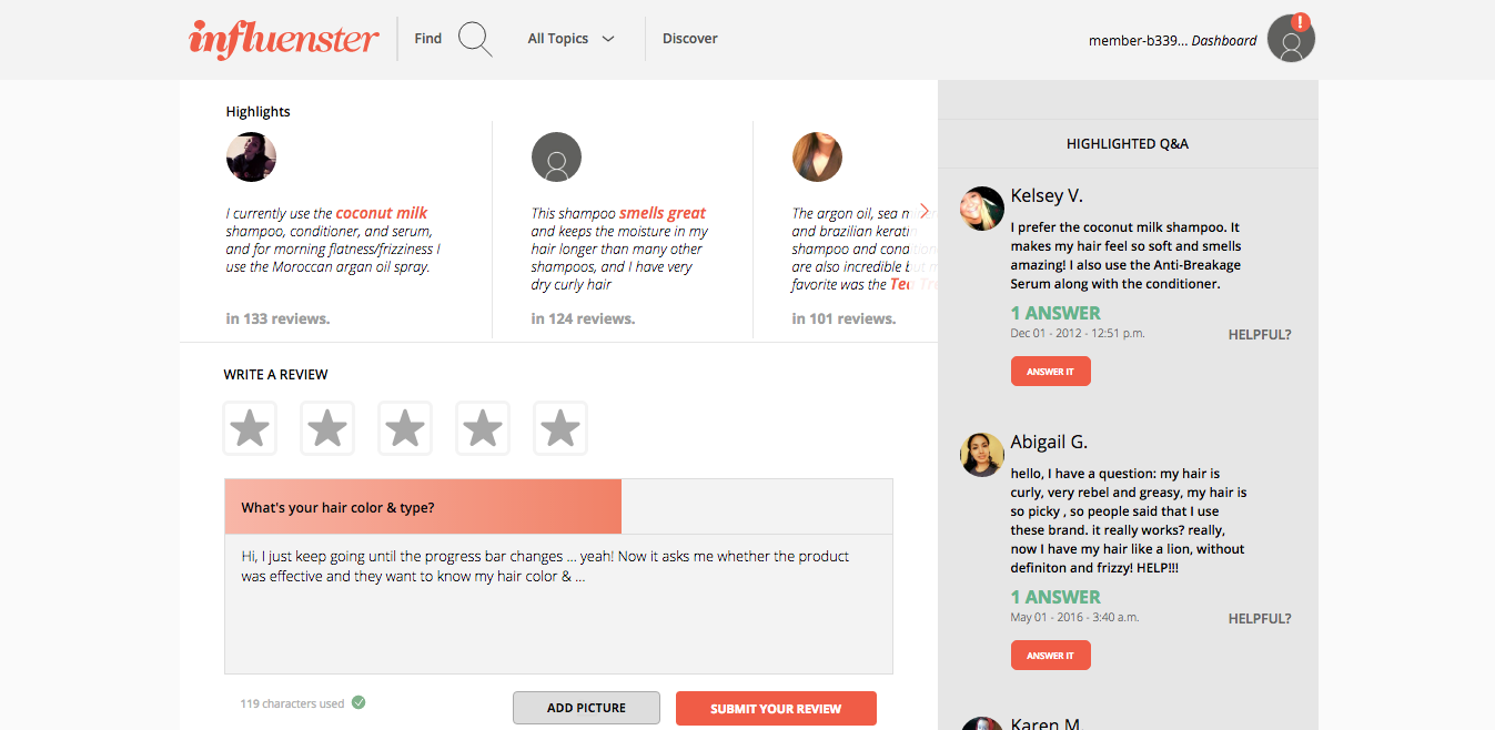
I have to admit that I’m not sure if I would like a progress bar calling my attention while I’m writing, but both of our testers found this feature really cool. And if it works for Influenster.com, I will be the last person to say anything negative about it.
But let’s see how Britney and Beyoncé sum up their experiences:
Final remarks:
↑ Beyoncé ↓ Britney
Did you notice Beyoncé’s excitement about the pop up letting her know she just earned 5 points for leaving a review?
Yup, gamification will delight many of your users. People welcome some motivation, especially if it’s well thought out. And that happens only if it’s integrated into your product, not added as an afterthought.
It’s interesting to note that Britney hasn’t noticed this reward at all.
She pauses for a moment after the green box disappears, but we can’t say for sure whether she even saw the pop up (in the upper right corner) while being focused on her review (in the center of the screen).
If you’re interested in how to draw people’s attention to something, I recommend you take a look at Jeff Johnson’s Designing with the Mind in Mind. You’ll learn the cognitive psychology behind UI design rules and understand how to effectively apply them to your situation.
Other than that, there’s not much left to say, because the folks at Influenster.com are doing a remarkable job at making the process of leaving reviews not only easy and effortless, but also fun and engaging.
5. Suggestions for improvement
Overall Influenster.com provides their users with an extremely intuitive and usable design, but as always, there are some things they could investigate to make it even better.
Tweaking and adjusting should never stop. Unless you want to stop.
Be aware of the message your images convey. Maybe it’s intentional to let the site look & feel like it’s for women only.
They probably have some demographic analytics on this. But even then, women have men in their lives they want to shop for.
So why have male products and hide them? Show some adversity, follow our lead.
Consider redesigning/rewriting your headline. We’ve watched thousands of user tests and learned that the headline is usually the most important aspect to forming a first impression.
In this case both users seemed to have ignored the headline. Maybe because it’s too generic (no offense), maybe because of too little white space around it, or maybe because of the images fighting for attention?
We don’t know, but it’s probably something worth exploring since our testers didn’t get the site’s purpose right away.
Improve your search function. This is super nit-picking, but since the search field in your main menu only appears on click, I have to point this out.
If you look at Beyoncé’s third video again, you’ll notice that she clicks on the search icon expecting the search field to appear, but nothing happened. I tried to reproduce the issue and found that if you click to open the search field while the page is still loading, the field will disappear again after the site has finished loading. Maybe there’s a way to prevent this from happening.
She also says she’s overwhelmed with products. In cases like these, the search field is users salvation, and so we suggest testing this big small feature and it’s effect on the User Experience.
And that’s it for this week! We hope you enjoyed your time and you find our UX Teardowns as useful and entertaining as we hope they are.
Of course you can also let us know if we suck, so use the comments below.
And if you’ve watched the videos and you found something that we’ve missed, please also let us know that too
BTW: If you want to test your own website, and learn how to come up with tasks, how to write scenarios, and how to analyze your data, just sign up below and get our upcoming UX Teardowns by email.
You will also receive our interactive and goodie packed email course called The Journey to Automated User Testing. It’s a different kind of email course, based on the Hero’s Journey, and we had a lot of fun creating it. So join the adventure!
Back to homepage