TryMata vs. Userbrain

Looking for a UX testing tool and comparing what's out there? We get it; everyone wants to explore their options. So we would like to make things a little easier for you. Here's a list of 8 differences between TryMata (formerly TryMyUi) and Userbrain:
testers
rating
1. Simple sign-up vs. too much data
It takes a fair few minutes to sign up at TryMata (formerly TryMyUi). Whereas, with Userbrain, it's more like a few seconds. We won't ask you for any excessive personal details. Once you've set up your email and password, you're good to go.
2. Userbrain offers flexible & affordable pricing
Userbrain offers a better selection of plans, starting from $59/month. So whether your user testing budget is $100 or $100,000 Userbrain has you covered. In contrast, TryMata's most affordable subscription is significantly more expensive than Userbrain's, at $333/month.
Remember, Userbrain also offers the option to pay annually. With an annual Userbrain subscription, you can save 20% off the monthly price.
Pay-As-You-Go user tests are also available at Userbrain, priced at just $45 per test. Save up to 33% when you purchase a pack of 30 credits or more. On the other hand, TryMata only offers a Pay-As-You-Go option if you're already subscribed to one of their plans.
3. Userbrain test credits always roll over
TryMata and Userbrain both offer user testing on a credit-based system. One credit = 1 UX test. With a subscription plan, you get a certain number of credits assigned to your account every month. All good so far.
But, since Userbrain was founded by a team of UX Designers, we know that things can change; you might not need to test one month, but you'll run a ton of tests the next! That's why we decided that unused credits will roll over.
4. Elegant simplicity vs. coarse complexity
Setting up a user test with TryMata is complex and, honestly, a little draining. You have to answer a boatload of unnecessary questions and tick boxes - before you've figured out what they even mean.
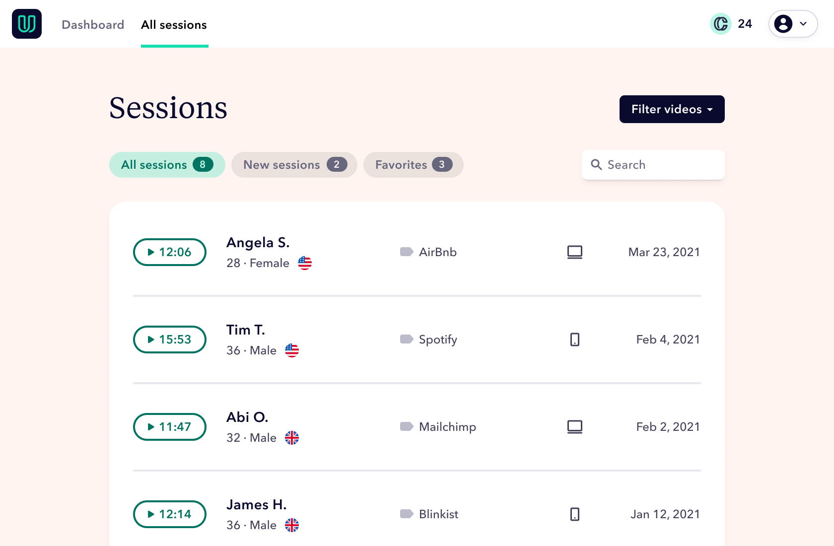
At Userbrain, we are all about keeping things simple and efficient, so you can get down to testing. We've removed all the red tape so you can focus on setting up brilliant task scenarios and measuring the responses. No fluff, no fuss.
5. Ready-made test scenario templates
We know that coming up with a test scenario can be a bit challenging, especially for the first time. That's why we decided to integrate generic test instructions. Userbrain's test scenario templates will help you understand what you could or should ask your testers. This makes setting up your first tests easier and helps you get into the swing of things straight away.
6. Intuitive design vs. confusing UI
At Userbrain, we do our best to not only talk the talk but also walk the walk. We were founded by four UX Designers who wanted to have this tool in our lives. We recognized a need and built the product to serve that need.
We don't just want to help our customers improve their UX and UI - we want to provide the best possible experience for you, too! Userbrain has a clean, modern interface optimized for efficient user testing, saving you time, money, and frustration. On the other hand, TryMata could have set a better example in this regard.
7. Premium user testing features as standard
Unlike TryMata, which unlocks features based on the selected plan, Userbrain offers full access to all tools necessary for executing outstanding unmoderated remote user tests, regardless of your subscription. This includes our revolutionary AI Insights, which analyzes user test transcripts and generates time-stamped notes, significantly reducing manual effort and time spent on analysis. Moreover, you get access to our global pool of 170k+ testers with every plan. Choose Userbrain if you're looking for a comprehensive, all-inclusive user testing experience.
8. Automated user testing vs. manual user testing
To figure out what's working or not, you should conduct UX tests more than once - ideally at regular intervals. With Userbrain, you can subscribe & save to test regularly and turn it into a habit - rather than a one-off thing you need to check up on.
Start your free trial with Userbrain and experience the difference for yourself. Still have some unanswered questions? Schedule a call with the Userbrain team.
Best in industry for easy user testing
“From start to finish it’s been absolutely phenomenal. I really do enjoy how easy it is to utilize this software, not only is it simple but extremely easy to learn in very straightforward.”
Excellent service and very easy to use
“Really like the experience, and happy to continue using this service. This is really easy to use, and you can get the videos within a matter of hours after deciding to test. The customer service is excellent, with the team getting back to you really quickly - and happy to give you replacement tests if any don’t work out technically.”
Userbrain is elegantly simple
“The customer service has been excellent — in the rare case we had a bad user test, they quickly refunded the credit.”
